2022 is not a year that anyone except the most reclusive could possibly claim not to have heard of the Australian Tennis Open – the high profile legal wranglings between the Australian Government and Novak Djokovic over his entry visa, covid vaccinations and his deportation, have made the already famous sports tournament front page news worldwide. Founded in 1905, the Australian Open, or the ‘happy slam’ as it is affectionately known, is the first of the 4 grand slam tournaments worldwide, which takes place in Melbourne every year. Although it is not the highest paid tournament (the prize money is only A$75m!), the Australian Open is by far the most popular in terms of attendance numbers, with 812,000 spectators attending the 2020 tournament.
Notwithstanding our current fascination with the dramas playing out in Oz, we, the public, have always had a fondness and affection for the game of tennis, one which is totally different to that of other sports, and one which goes back centuries to its origins. The racket sport we now call tennis, is the direct descendant of ‘real’ tennis or ‘royal‘ tennis, which continues to be played today as a separate sport with more complex rules. Most historians believe that tennis originated in the monastic cloisters in northern France in the 12th century, but the ball was then struck with the palm of the hand; hence, the name jeu de paume (game of the palm). It was not until the 16th century when rackets came into use, and the game as we know it emerged. The roots of the game are firmly linked to the royal courts of France and England, with Henry VIII of England being one of the most avid players of his day – his luxurious tennis courts still remain to this day at Hampton Court Palace. In France the sport was so firmly associated with the Court and Nobility that during the Revolution many of the tennis courts we deliberately destroyed as a sign of a new era emerging.
Subliminally these Aristocratic links and associations have remained with us into modern times. Tennis still has the perception of being a genteel sport, one which is played out on immaculate lawns on sunny summer afternoons, with players dressed in immaculate tennis whites. One only has to look at Wimbledon to confirm this – the tournament is so much more than simply a sporting occasion, it has become a firm part of London’s social season, with its Royal Box, champagne, strawberries and cream! Without doubt this image belies the seriousness of the sport, and the huge financials at stake in modern tennis, however, it is also this je ne sais quoi that also adds to its modern success.

Depictions of tennis in western art very much follow the image of tennis as a jolly, social pastime played by the leisured classes and gilded youth. The summer is always eternal, and the player are carefree without a worry in the world! One of the most brilliant and prolific painters of this subject is the Victorian artist Sir John Lavery, who is more usually associated with the glamorous and elegant society portraits he produced throughout his life. Tennis, however, fascinated him and he returned to paint the theme on a number of occasions, producing both informal studies and highly complicated compositions.
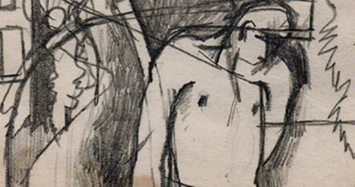
One of the earliest depictions is Lavery’s 1885 painting, Played!! which captures the movement and drama of an exciting new sport, as a young woman lunges to return serve. In the early 1880s, Lavery had returned from Paris, where he was studying at the prestigious Academie Julian, and was quickly taken by the game. In the summer of 1885, he visited the home of a friend in the suburbs of Glasgow, where a tennis court had been set up. The painting was inspired by this visit, and marked a new direction for the artist, away from his more usual society portraits towards depictions of ‘modern’ life – no doubt influenced by the Impressionist works he would have seen during his stay in Paris. His choice of the subject and naturalistic portrayal was considered extremely avant-garde at the time. Lawn tennis was then at an interesting stage in its development as a modern sport. It had emerged in the 1870s and had been inaugurated at Wimbledon as recently as 1877, when the All England Croquet and Lawn Tennis Club introduced men’s singles championships. Ladies’ singles and men’s doubles had not been incorporated until 1884. The process by which women arrived on court was a gradual one, then, and mixed doubles matches were yet to come.
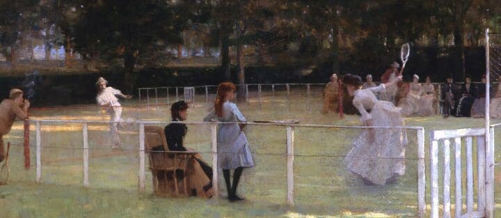
Played!! turned out to be a mere prelude to Lavery’s undoubted masterpiece on the subject which painted the same year. The Tennis Party, which is in the collection of the Aberdeen Art Gallery and Museums, is an absolute tour de force of a painting, showing huge sophistication of composition, movement and bravura brushwork. In spite of its apparent spontaneity the picture is not merely an arbitrary slice of life, rather it is highly constructed work aimed at giving the illusion of spontaneity. The depiction of both male and female players in the same game, which seems uneventful to a modern viewer, would have been the height of modernism at the time, where casual, real-time depictions of the opposite sexes cavorting together was very rare at the time.
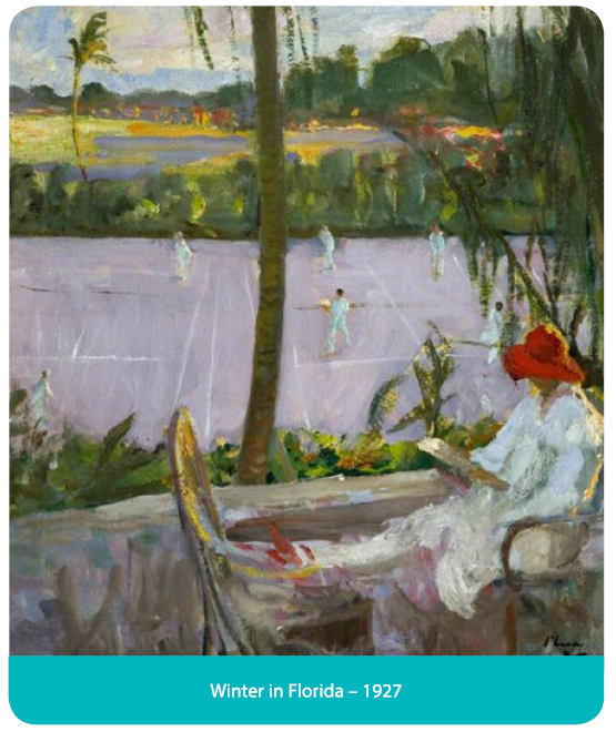
Throughout his career Lavery, returned often to the subject of tennis, which more than any other sport held his fascination. Although Lavery’s first depictions of tennis might have been painted in Scotland, his later works were increasingly international showing the growing popularity of the sport. The paintings Lavery produced in the first quarter of the 20th century whilst on the French Riviera and in America are some of the most spontaneous and evocative depictions ever produced on the subject. Whether they were painted at the famous courts at the Hôtel Beau Site in Cannes – then ‘the’ place to go for well healed British holiday makers, or at the courts of the Breakers Hotel in Florida or in the private residences of Palm Beach, these paintings have a freshness and sense of movement which still have the power mesmerise to this day.
Lavery’s 1885 The Tennis Party remains, however, his most accomplished and monumental depiction of the sport, an image which, more than any other artwork has influenced our vision of what we feel tennis ‘should’ be, and it remains to this day the quintessential image of the sport.


 In 1974 I worked for Alex Postan Fine Art and was entrusted with getting publicity for the show of etchings, which included watercolours and acrylics as well as prints. It was the easiest job I have ever had. Marina Vaizey wrote a half page review of it in The Telegraph, Bill Packer, a half page in the Financial Times and it was in the list of the 10 best things to do this Christmas in London in the Daily Express. Rod Stewart came to the private view. Oxtoby went on to exhibit with the Redfern Gallery in Cork Street in the 70s where the private views would sell out. Elton John bought Oxtoby’s canvases in vast numbers, for prices that were somewhere between Hockney and Picasso. He is still with the Redfern.