Marilyn Monroe – Shot Sage Blue Marilyn

She was THE film star of her day, and at the auction on 9th May 2022 at Christie’s New York, she proved that her star power was as strong as ever!

In under four minutes of bidding, Andy Warhol’s 1964 painting of Marilyn Monroe, Shot Sage Blue Marilyn, sold for $195,000,000 to an unknown buyer, making it the highest price achieved for any American work of art at auction – comfortably beating the world record of $110,500,000 that Basquiat’s Untitled, 1982 made at a Sotheby’s auction in New York in 2017.

Described as ‘the most significant 20th-century painting to come to auction in a generation’, Shot Sage Blue Marilyn is one of only 5 works Warhol produced in this series – each in different colour variations.

The paintings were stored at The Factory, his studio on East 47th Street, Manhattan. It was here that the artist, Dorothy Podber, stopped by and asked Warhol if she could “shoot” them. Presuming she meant with a camera, he said yes, but instead she pulled out a revolver and shot all but the turquoise print in the forehead! Warhol had the four paintings restored and they became known as the “Shot Marilyns.”

The work was the undoubted and much-anticipated star lot of the Christie’s Monday sale, which itself kicked off New York’s spring season of mega auctions. As such, it was always going to attract huge interest, eventually selling to Larry Gagosian for an undisclosed client.

The sale itself was made up of 36 lots consigned from the estate of the legendary Swiss dealers Thomas and Doris Ammann, with all of the proceeds going toward their foundation, which supports health care and educational programs for children. Interestingly and very old school in approach, none of the works were backed by financial guarantees, which is a system whereby the auction houses provide sellers with a minimum price at which a third party or the auction house has committed to purchase the work even if it fails to sell on the day.

Perhaps a risky approach one might think, however, after 2 years of pent-up demand from collectors, and with huge amounts of money sloshing around, and with such star works on offer, it was a risk well worth taking, with the overall sale achieving $318,000,000 for the Ammann charitable foundation. Lucky them!

It all goes to show that quality will always win out, and the best works will always achieve the strongest prices. That said, having Marilyn on your side can’t hurt either!

F is for Filigree

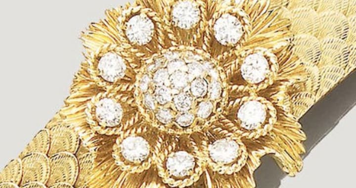
The word filigree derives from Latin “filum” meaning thread and “granum” grain. It is a form of intricate metalwork, usually made of gold or silver. The Latin words gave filigrana in Italian which itself became filigrane in 17th-century French and shortened from filigreen in English.

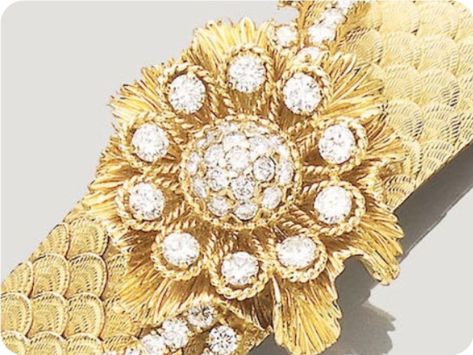
The technique consists of using tiny beads or twisted threads, sometimes both, soldering them together or to the surface of an object, such as a bracelet or brooch for example. The result is a highly artistic and detailed work of art.

Its origins can be traced back to the Egyptians and along the coast of the Mediterranean. Archaeological digs have found the technique to be incorporated into jewellery dating as far back as 3,000BC.

“Necklace in gold filigree of Queen Twosret and earrings of her husband Seti II. Discovered with a cache of jewellery inscribed with the names of Seti II and Twosret in the Gold Tomb (KV56) at the Valley of the Kings, West Thebes.

The cornflower and ball beads in this necklace were made by soldering wire rings of several different diameters into the desired forms. The piece is an early example of the technique known as filigree. New Kingdom, Late 19th Dynasty, ca. 1292- 1189 BC. Now in the Egyptian Museum, Cairo.”

It was greatly used by Portuguese goldsmiths, using both gold and silver filigree.

The elaborate metalwork also included techniques such as granulation, wire and scroll.

The small beads are applied to the surface through heat with visible solder. This technique was used by the Etruscan civilisation of ancient Italy in Tuscany, western Umbria and
northern Lazio (700-300 BC). Its style was made famous with Etruscan revival jewellery, modelled after the ancient Roman empire. The most famous jewellery designer to create Etruscan Revival pieces was Castellani.

“The head in the form of a thyrsus, an ancient Greek stylised pine cone, with twisted wirework decorations, bearing Castellani’s double C’s hallmark on the base, all to a yellow gold pin, circa 1860, measuring 2.5 x 1.1cm, the pin measuring 4.9cm long, gross weight 4.7 grams.

A collectable stick pin in the shape of a pinecone, made in London around 1860 by Castellani. This charming pin features twisted wirework filigree decoration, a technique used in Ancient Etruscan jewellery, and would today make a perfect and eye-catching addition to a silk tie.”

Though it is an ancient jewellery technique, it is still frequently used in today’s jewellery, especially in Asia and particularly in Indian jewellery.

The technique should not be confused with cannetille. Filigree’s fragility and delicateness suggests lace, in a flat form. Cannetille has a 3-dimensional aspect to it, sometimes with added repoussé work to it – which is a method of hammering metal into relief from the reverse side.

There was a renewed popularity for filigree in Italia and France between 1660 to the late 19th century, with the fashion reaching its peak in 1830.

A decade later, the precise and time-consuming technique of filigree and cannetille had been replaced by repoussé, which offered a similarly inexpensive artistic and decorative way of setting stones.

Like many metalwork techniques, its origin is far behind us but its use and technique are forever evolving. It is understandable that this craftmanship would be a favourite for different cultures
and throughout time. Though some modern pieces of that style may be inexpensive, the cost of purchasing a traditional parure reflects the art and the know-how that is filigree.

“A fine Georgian citrine and gold parure, consisting of a necklace, a pair of earrings and a pair of bracelets, the necklace consisting of an oval-cut faceted citrine surrounded by a gold frame of foliate design, suspending three detachable drop-like pendants, each centrally-set with a pear-shaped citrine, all suspended by a double strand of tubular mesh chain with box clasp of similar
design, set with an oval faceted citrine, each bracelet with a clasp of similar design, each centrally set with an oval faceted citrine, to a gold mesh ribbon-like bracelet, the earrings of matching gold foliate design consisting of an oval-cut faceted citrine suspending a pear-shaped faced citrine, all mounted in yellow and rose gold, circa 1820, accompanied by original fitted box, the necklace measuring approximately 38cm long, gross weight for the suite 71.5 grams.” Selling for £37,500

Watches Update

Well, if we thought that 2020 couldn’t be surpassed in the watch world – we could not have been further from the truth!
We must start (we really do) with what was without doubt the biggest drop of 2021 – the Tiffany/Patek Phillipe 5711 – 1A/018

We are all very aware that one of the most desirable watches in the Patek Phillipe arsenal is due to be retired this year and as such the last 18 months have been spent by watch aficionados talking about how the standard Patek Phillipe 5711 has risen to the ranks of a £175,000 wristwatch when compared to a few years ago – it really is astonishing.

So, when the powers that be decided a send-off to conquer all others was required – they called in the big guns, and that robin egg blue dial appeared from nowhere. 170 will be produced and available exclusively from Tiffany boutiques and one can only imagine how these may perform on the secondary market – in a recent charity auction, one of the 170 sold for a jaw dropping $6.5 million, which is simply staggering for a watch that retails at a few bucks over $52,000.

Now some people amongst you will be aware that Tiffany has recently been acquired by LVMH and this moment has clearly been defined by the 5711 – 1A/018, it even has a little nod to the recent acquisition on the engraving of the caseback – a little brash? Maybe, but I am fairly sure that most watch people won’t notice the difference and hope that the work between the two companies will continue as it has done for the last 170 years.

As far as the rest of 2021 happened – it was pretty much a continuation of 2020, with rises across the board of Patek Phillipe, Audemars Piguet, and of course… Rolex sports models.

At the start of 2021, a 116610LN could be acquired on the secondary market for just short of £10,000 now, it’s closer to £16,000. Considering back in the pre covid days of 2018, on a good day you could get one for closer to £6000 – it hasn’t been a bad investment and if you bought the green bezel model – well that’s a completely different story!

Other highlights of 2021 have included the Bremont ENG300 – Whilst the English brothers may have had to fight off some arguments about the origin of parts of their watches, this new model has what appears to be a well-researched in house movement, that really is a game changer for the UK watch industry.

The Cartier Solarbeat, is certainly a watch for the risk taker – a person that wants a classical design with one of the most forward-thinking developments of the year – a solar powered Cartier, its doesn’t sound right saying it, but could you tell the difference? At a really good price point as well, one would have to be brave to bet against it being a huge success.

Finally, what has to be my watch of the year is the Tissot PRX, starting at under £300 (yes, three hundred pounds) it is an amazing retro design with hints of the big boys, but with a price tag that makes it far more accessible to enthusiasts on a lower budget as well.

What will 2022 bring? It’s difficult to say but with watch shows being planned for throughout the year, and design teams back at their desks I am sure that there will be a few surprises ahead!

E for Eternity Rings

Eternal love

How better to declare one’s love but by gifting an eternity ring?

Sometimes called Infinity ring, it is a band set with identical gems throughout. Just as the snake rings represented undying love, eternity rings seem to be the modern fashionable jewellery item to state such devotion.

Traditional materials

It is thought eternity rings have been gifted as far back as the 4th century BC. They were made of plants, such as hemp, or reeds and even elephant hair.

A tradition that went long into the Victorian era. Nowadays, these bands are made with precious metals such as gold and platinum. The stones have evolved from paste to sapphire, ruby in the 18th century to diamonds in the second half of the 20th century.

Engagement rings

Until the 1960s, an engagement ring would traditionally have been set with a diamond single-stone. It is rumoured that due to the surplus of small diamonds, approximately 0.25ct and smaller, the jewellery giant De Beers created a campaign in which they would use these smaller stones, set them in Eternity rings and promote this new essential jewel to couples who had already been married for several years.

Range of price

Eternity rings will come a wide range of price. What will impact this price? Materials such as the metal used will be the first component. A ring can be made of silver, gold or platinum, being the most expensive.

Secondly the stones will affect the budget the most. When an eternity ring is set with precious stones, it is important to remember how much carat weight the ring has as a total but also looking at each stone individually. The larger each single stone is, the pricier the ring as a whole. The “purity” of the stones is an element that cannot be forgotten either. Whether it be rubies, sapphires or diamond, the clearer the stones, the more desirable they are and therefore the more expensive they will be. We refer to this grading scale for diamonds as the four C: colour, carat, cut and clarity.

Navaratna ring

Navaratna – from the Sanskrit Nine (Nava) Gems (Ratna) – jewellery consists of an item of jewellery, necklace, bracelet

or ring, set with nine gems: ruby, diamond, pearl, red coral, hessonite, blue and yellow sapphire, emerald and cat’s eye. The Navaratna rings can be considered as a form of eternity ring, present in almost all Asian countries, beyond India where they originated from, regardless of religion. There are a few rules and traditions as to how to place the stones and how it should be worn. Women are to wear the ring on their left finger while the men on the opposite hand.

The ruby which represents the sun, should be placed in the middle and the gems should be of the upmost quality, making these jewels very precious indeed.

Infinite brands

Eternity rings are so popular that every luxury brand has taken to create and promote them as unique and essential jewels in a lady’s collection.

Tri-factor

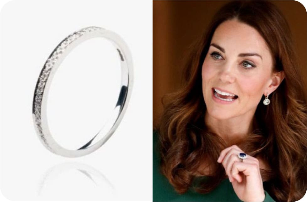
Eternity rings possess the tri-factor: they make a statement all the while remaining discreet, and elegant. Who best to illustrate this than the Duchess of Cambridge, who not only wears her wedding band along with her engagement sapphire and diamond cluster ring but also a diamond eternity ring on top. The Eclipse diamond ring by Annoushka, is set with 0.23ct total of diamonds and retails at £1,500. It is said to have been a gift from the Duke of Cambridge for the birth of their first child, Prince George.

Your choice

So when should an eternity ring be gifted? Which finger should be worn on? Which brand to choose? Which gem? Which metal? So many choices to choose from it’s no wonder they have swept the jewellery market with ease. Some might say, it should be gifted after decades of marriage, others prefer to gift it as an engagement band, some may want diamonds, others precious stones such as sapphires. Offered in a variety of style and at various price range, as one of Britain’s favourite matchmaker Cilla Black would say, “The decision is yours”!

D is for Diopside

Diopside is an igneous and metamorphic rock. This means it forms from the solidification of its molten state and has been subjected to extreme heat and pressure deep below the Earth’s surface, very much like how diamonds are formed.

It is found across the globe and more readily available in the Earth’s mantle than at the surface.

Commercial diopside can be found in Siberia, Russia, though in limited amounts. The prized chrome diopside (green colour) is sourced in Europe (Austria, Finland and Italy), South America (Brazil), Canada (Ontario and Quebec), the state of New York, Asia (India, Pakistan, Sri Lanka, Burma) Madagascar and South Africa.

What do we mean by commercial? Stones that are of a particular quality that can be cut and set into jewellery.

Although there are several deposit sites none of them produce regularly or in significant quantities and is therefore not usually mined due to the lack of return.

Diopside rates a 5 to 6/10 on the Mohs scale. The Mohs scale of mineral hardness was created by Friedrich Mohs in 1822 and determines the scratch resistance of minerals when scratches by another mineral.

The Mohs scale is used to manufacture everyday objects: your mobile phone’s screen glass is made of a material that scratches at level 6, some at level 7.

Diopside has fair toughness and is suitable to be set in jewellery, however it should be worn with caution and should be handled with care as it risks being scratched or broken.

Diopside comes in a various colours ranging from greyish white, light blue to purple, light green to vivid green, brown, black.

The most sought-after colour is green, called chrome diopside. It owes its hue to an increase of chromium.

This rough chrome diopside ring (pictured above) sold for £3,187 (including premium) in June 2021.

The other popular variation is star diopside which occurs in black (pictured below).

It displays chatoyancy (or cat’s eye): a 4-rayed star caused by reflection of light at needle-shaped inclusions of magnetite. It makes for a lovely gem to be set in brooches, rings and pendants as the star will shift along with movement and light. A good alternative to star sapphire for more modest budgets and a real “waow” effect!

This brooch (pictured below) is up for auction at the end of May with an estimate of AU$ 600-800 (GBP 340-450) with Bonhams.

Because diopside is a metamorphic rock, it is used as an indicator for diamond deposits. Diamonds arrive to the Earth’s surface through deep volcanic eruptions and travel through pipes, very much like chrome diopside. Hence when the green stone is found at the surface, diamonds could be near. However, these pipes will only ever produce around 2 carats per ton.

It’s easy to understand the appeal of chrome diopside as an alternative to the more expensive green gem that is emerald, but its popularity is moderate for several reasons. As we know, diopside is soft on the Mohs scale and therefore risks easy damage. The look of chrome diopside also works to its detriment. It has a vitreous and sugary aspect as opposed to clear, transparent emeralds. It is for these reasons that the stone is less known by the public but all too famous amongst diamond miners!

Bridget Riley, Turning 91

‘Nature is the origin and feeds what I make’

As Bridget Riley turns 91 we look back at the work of a truly groundbreaking artist whose life and work is influenced by nature in all its forms.

‘I am a painter and that’s what I do’ said Bridget Riley in a recent BBC interview and looking back to the 60s you see just how fresh and new her work still is and as the years have gone on it only looks better, fresher and more new. Bridget Riley has spent 60 years pushing the boundaries of what is possible in art and continues to do so. Cornwall has been a major influence on Bridget Riley’s work almost from birth. Her great grandfather had built a Cornish family home on the coast in the 19th Century and at the outbreak of the War in 1939, Bridget along with her sister, mother and aunt decamped to Cornwall where they remained for the duration. Her father was away fighting and early on in the war was declared ‘missing’ which remained the case until happily at the cessation of hostilities the family was reunited. So in these formative years her influences were all female as they shared a small four room Cornish cottage. Bridget didn’t go to school for the five years the family was in Cornwall which she described as ‘heavenly, there was no transport and nowhere to go and no particular reason to go anywhere ‘ She was able to absorb the world around her watching the way waves move the unique shapes they make, there was just nothing else to do but to look and appreciate the world around her in this extraordinarily beautiful coastal landscape. There was a war on so there was no petrol for private cars and no public transport so you had to walk everywhere. Bridget’s fate as an artist was probably sealed during this time as both her mother and aunt had studied Art at Goldsmiths College so probably the foundations of her artistic future where laid and set during these heavenly five years. The shapes the sea makes as it rolls in and out on the tides were endlessly fascinating to Bridget. As she says herself ‘they will never be the same again each and every time they’re different, every single wave every single ripple, every single breaking of a wave on a shore or rock all are unique and have never happened before and will never happen again.

After the war Bridget began her studies in London and was classically trained at Goldsmiths College then followed by the Royal College of Art for some more classical training, all focusing on painting, drawing and sculpture. Her class mates included Peter Blake, Frank Auerbach and John Bratby. Her student work while at the Royal College is very much what was expected of you in the 1950s, sombre and faintly French narrative paintings nothing at all like you associate with Bridget’s work now. Bridget left the RCA in 1955 and intent on being a painter she set out to find her style, she found the work of Georges Seurat resonated and strongly influenced her then and for the rest of her life. She saw in his work something similar to what she was looking for, something new and different. For a while during 1959, she experimented by both adopting his style and by faithfully copying one of his pictures called

Bridget Riley's Seurat style original work from 1960

Bridget Riley's 1959 copy after George Seurat's work titled Le Pont de Courbevoie

‘The Bridge at Cordova’ a work dating from 1887. Her progress towards what we see as her familiar work today moved more rapidly as the 60s dawned, when everything that was needed to change social barriers and norms fell away and everyone was open to new ideas and looking for ways to progress fashion and trends further and faster than ever before. Bridget viewed the Art world as pretty stagnant in the 1950s, indeed she had a particular phrase she used to describe it ‘ Infectious apathy and vicious insularity’.

At this time the Whitechapel Gallery in London was at the epicentre of what was new and happening in Art, its director Brian Robertson was bringing over the work of the American Abstract Expressionists such as Mark Rothko and Jackson Pollock which encouraged the young British artists of Bridget’s generation to claim this space to showcase their work with confidence that it was all new and fresh and of its time.

Bridget Riley was inspired to create work that looked like nothing anyone had ever seen before, she not only broke the mould she literally blew it up! ‘The Kiss’ appears as one of her earliest groundbreaking images in 1961, in her first show in London when she really hit her stride and she had finally broken away from all the 19th Century conventions she had been taught about constructing a work of art.


We use ‘Abstract’ to describe Bridget’s work, but for me and many others including Bridget it’s not the right or appropriate word, it’s something else that draws from nature and shows nature. In these early years all of her work is black and white, what changes are the shapes, forms and movement variations. By 1962 discs appears with the movement expressed by the fading of the discs from left to right strong towards the centre and then fading out towards the sides this picture marks the beginning of experimentation between what the artist sees and what the viewer experiences, experimenting all the time with what it feels like to look at a work.

At the same time, the early 60’s witnessed the arrival of the Op Art, Psychedelic Movement with the appearance of mind bending art experiences teamed up with light and mechanical ways of making patterns to create optical illusions for an audience hungry for Psychedelic experiences.

It was a blockbuster exhibition of mixed International Contemporary Artists at the Museum of Modern Art in New York in 1965 that sealed Bridget’s reputation as a major international artist. The exhibition took NY by storm, welcome as this was Bridget was totally taken by surprise and made uncomfortable by seeing how fast her art flowed out from MOMA onto the streets of NY. Within days of the opening her images had been siphoned off onto dresses, skirts T-shirts and fabrics of all sorts which defined the era for the rest of the 60’s.

However in commercial terms it was all out of her hands, imagine creating a series of paintings for a major exhibition and in the next morning it’s key elements are all in stock in Bloomingdale’s, all without your permission or involvement.

Colour appears in 1967 when along with the sculptor Philip King Bridget is selected to represent Britain at the Venice Biennial, where she becomes the first Briton and the first woman to win the International prize for painting.

Bridget’s work has continued to evolve and change over the intervening sixty years, in 2015 she returned to Black and White, Discs re-appear in her Annenberg Court painting for the National Gallery and now her work brightens up the long corridor walls of major hospitals in London and Liverpool. A trip to Egypt in the late 70’s brought a new series of works limited to the Egyptian palette of five colours only and the market for her work, once focussed only on the 1960’s has now broadened out to include all and everything and we all at Doerr Dallas wish Bridget a very happy 91st birthday on April 24th.

Drama of Light and Land: The Martyn Gregory Collection of British Art

For the second time in two years, a good friend of mine has offered a portion of his stock for sale at one of the major London Auction Houses.

Last time around it was Rafael Valls at Sotheby’s, consigning Old Master oil paintings. I need not have fretted, all but 2 sold, but this time, it was Martyn Gregory offering British watercolours at Christie’s, a far more challenging proposition.

There are several reasons why watercolours do not chime with modern taste. The first is their fragility. We now know that light comes in particles and waves. We have always known that it generates heat and it fades watercolour pigments, if it hits them directly. This can take just a matter of a few years. They are also susceptible to attack from silverfish, if they are coated in Gum Arabic, the substance which made Osama Bin Laden’s family fortune, you may remember, and which was much used in the 19th Century by watercolourists to give depth to the colours. Silverfish love to eat Gum Arabic and when they do, it takes the pigment with it, leaving blank squiggles across the paper!

Watercolours are often painted on acidic paper and this can discolour and damage the pigments too. Furthermore, the big exhibition ‘machines’, the enormous watercolours ‘finished’ to a high degree, which the O.W.S. (Old Watercolour Society) and others produced in the early 19th Century, with a view to them holding their own, visually, when hung in exhibitions next to oil paintings, are totally out of fashion.

This is the background against which Martyn Gregory’s British Landscapes were offered. Christie’s were confident the sale would succeed and to sell 149 out of 194 lots proves them to be right. However, a closer analysis of what happened is revealing. The sale total was £559,864 including buyers’ premium, which adds nearly 34% to the hammer price. The lots averaged out at just over £3,700 each. When I was at Bonhams 10 years ago, we calculated that any lot selling for under £10,000 lost us money. (In this sale only 14 lots hit this threshold and that is including premiums) It must be the same for Christie’s. We can only speculate that they hope to get the rest of his stock in due course!

The landscapes that appealed most were wild places with dramatic stormy skies or lowering cloudy sunsets or both. The first 5 to exceed £10,000 were all Scottish scenes. Lot 5, the Turner of Oxford of Loch Torridon under a moody dawn sky was a very impressive example of this genre, as was his Sunset over Loch Coruisk on the Isle of Skye.

There was a classic harvesting scene by de Wint, painted on a warm late summer day at £15,000 and a fascinating and rare whaling scene in the Arctic by John Cleveley which made £20,000. However, despite these watercolours being well-chosen examples, in good condition, selected by an expert with a very good eye and promoted by the Christie’s International publicity machine, one came away with the feeling that British Watercolours, which were so sought after by collectors in previous decades, are somewhat passé.

In real terms most are worth a tenth of what they were 50 years ago. When will it be time for their re-assessment?

London Art Business Conference Report

Jonathan Horwich at the London Art Business Conference

Jonathan Horwich, Modern & Contemporary specialist reports on the London Art Business Conference, 25 March 2002.

The scene was set as I entered the Gothic gateway into Deans Yard, behind me was Westminster Abbey and opening out in front of me was Westminster School to my left and in the air Westminster Abbey choir practising for the Duke of Edinburgh’s Memorial service for the following week. It felt and sounded a bit like a scene from a Harry Potter film as I walked up to the Church House were, after two years, finally we’re all back together again enjoying some proper face to face communication, which is so important in the Art world.

On arrival I bumped into Melanie Gerlis, the conference chair who is a powerhouse presenter and well able to hold the attention of a room full of noisy Art professionals. Melanie gave the opening address which was followed by a panel discussion on Sustainability and the Art World. The panel included Chris Bentley from AXA, speaking about sustainably insuring art in transit; Tom Woolston from Christie’s spoke about his firm’s 10 years to net zero programme. Imogen Prus from shippers Convelio spoke about new materials and methods of shipping and their plans to reduce the use of air transport. Lastly Cliodhna Murphy the Director of sustainability at International Contemporary Art dealers.

Hauser and Wirth spoke about their plans to reduce the galleries carbon footprint.

Louisa Buck from the Art Newspaper was moderating the discussions which focussed on reducing air travel which is the most significant and heavy polluter. The aim is to try and reduce movement of art by air, the majority of which is for auctions and travelling exhibitions, while at the same time not depressing the market. It’s a hard trick to pull off, there were discussions about moving art by sea container which comes with its own difficulties. The captain of the ship has the right to move or worse remove any container on board even if it is full of valuable pictures. However, I think we can look forward confidently to significant changes in sustainability for shipping in the art world going forward.

This was followed by an inspiring all-female discussion panel outlining just how extraordinarily quickly the African Contemporary Art market has moved up in value in very recent years, up 44% since 2020! particularly at Sotheby’s who only began selling in this category in 2016 following the arrival of the extraordinarily hard working and dedicated specialist, Hannah O’Leary. Not only is she running Sotheby’s very successful auctions in this category but she is also traveling the world, leading fundraising initiatives across Africa & Europe to enable artists to have access to safe living and studio accommodation, so they can just focus on making art.

Our next panel was also an all-female panel discussion on ‘women innovating in art’ with new tech. and finance. Stacie McCormack talked about her App, FairartFair, which enables you to buy art direct online via virtual exhibitions and studios tours all at very reasonable prices with no commission, it’s an amazing App. which is continuously evolving.

Anna Lowe of Smartify was a very inspiring speaker, she set up the app Smartify from scratch, the app allows you to take a photograph of any work of art in any museum and it will instantly identify the piece and give you the artists name and work details whatever and wherever it is in the world you’re looking at… the app was developed hand in hand with all the museums cooperation so they have embraced the idea and are moving away from earphone headset guides that you have to hand in at the end of your tour.

Smartify enables you to know what you are looking at and retains the art you saw on every trip so when you get home you can share the images and details in all the usual ways from any trip. The museum can use the App to see how popular their museum is in real time and also which are their exhibits are the most popular. I spoke to Anna later and she told me she is looking for new investment for the expansion of Smartify.

Rebecca Fine told us about her business, Athena Finance, they loan against owned art in order to allow owners to have liquidity on demand.

The final panel discussion on NFT’s was another fascinating session, with a strong cross-section of panel members including Xin Li-Cohen (founder of TR Lab, an NFT portal)

Alex Estorick (founder, right-click-save) who for some inexplicable reason had shaved his head and was wearing a bright green freebee tennis sweat band) Joe Kennedy (Unit London) and Brendan Dawes (NFT artist).

Alex’s presentation was an extraordinary tour de force, his app ‘right click save’ really led us through the pluses and minuses of NFT’s and his depth of knowledge and grasp of the details was quite extraordinary.

Joe Kennedy of unit London similarly is involved in NFT’s and was a contrast to Alex in his description and very engaging. Brendan Dawes the NFT artist was a revelation, he told us that as an artist, NFT’s have absolutely transformed his life, he was no longer thinking how to pay his bills, he was now very comfortably off, making art and engaging with his collectors, often one-to-one through the website ‘discord’ that enables collectors to communicate directly with Brendan and other NFT artist. He did say that it sometimes can be quite exhausting but stimulating, after an hour with 1000 voices asking you questions you really need a lie down!

Xin Li-Cohen (TR Lab) was personally involved in advising Chinese clients on the record breaking $69 million sale of Beeple’s NFT ‘5,000 days’ sold at Christie’s New York in 2021. She founded TR lab after the auction to sell NFT’s. Brendan Dawes is one of TR Lab’s top artists.

The NFT and Contemporary African art panels were highlights for me, however the whole event was wonderfully run and gave out very positive vibes confirming that the Art World is busy getting back to normal…

Pandemic Pearls – Biggest shock for Years?

Pearls – the gem that will go with everything, crosses the generations and decades. Safe, predictable, eternal. Is now the time to reassess their value?

Thanks to the Chinese market, there has been a growing production of quality fresh-water and saltwater pearls over the last decade. The downside of this monumental growth is that the market is arguably becoming saturated.

This is borne out in the price of pearls at auction. Japanese salt water Akoya, good Chinese fresh water and even small Tahitian pearls keep on under-performing and can be picked up for next to nothing.

This situation may be about to undergo a seismic change.

If I can cast your mind back to 2020, the world literally stopped. Not only the obvious things such as air travel and carefree shopping, but the thousands of ‘route to market’ supply lines. This included the people who support and make those supply lines run like clockwork – Normality went on hold.

Pearl Creation

The industry of Pearl farming and production walks a delicate tightrope between man and nature. There are many different types of pearl bearing molluscs, who have their own specific growth cycle, but to make a generalisation each pearl mollusc is either dived for by hand or is born, raised and seeded in stringently checked temperatures with the correct food, space and daylight. This process generally can take between 2-4 years of consistent care and attention – this was not possible during the pandemic.

During the global lockdowns, pearl growers, specialists, itinerant labourers and their vital support network all returned home. For the first time in decades, the seasonal flow of global pearl farming ground to a halt as there simply were not enough people to assure the continuity especially for South Sea, Tahitian and fine quality pearls.

Take the case of Paspaley in Northern Australia, a three generation pearl farming family who produce some of the most beautiful pearls in the world. They were so affected by the pandemic that they applied for and received a licence for specialised staff to continue working, but they were only allowed to work on boats moored offshore so there was no chance of Covid spreading. Even with this intervention their normal levels of production were curtailed.

This seismic shock to the usual farming life has caused a gap in the pearl production world and a shadow over future yields over the next few years.

Only time will tell what the quality and yield will be but it is understood by those in the know that it will take 2-3 years to get ‘back to normal’.

The basic economic principal of supply and demand may come to bear with reduced gem quality pearls coming to the market where the prices may harden and quite likely increase. Not only will this hopefully invigorate the auction pearl market but also remind pearl owner’s to have their pieces re-valued. Depending on how this industry is affected, Covid may have caused the pearls in your jewellery box to be very under-valued. A once predictable and safe commodity may have a trick in the tail and prove to be more valuable than they once were.

The King James Bible

The King James Bible first appeared in 1611. No special tribute was paid to it then, yet it became the ‘Authorised Version’ for English-speaking Protestants, universally read or listened to from the mid-18th century onwards.

Perhaps the secret of its success lay in its secure foundation in the work of William Tyndale and Miles Coverdale. Tyndale’s New Testament of 1525, the first English translation of the Bible ever printed, survives in one imperfect copy. Tyndale was burned at the stake in 1536. But all subsequent translations owed much to him, and ‘nine-tenths’ of the King James New Testament is said to be his work (David Daniell, William Tyndale: A Biography, 1994, p. 1).

Whereas Tyndale worked in isolation, the making of the King James Bible involved a massive collaborative and consultative effort. Some fifty translators were divided into six committees in the three locations of Westminster, Cambridge and Oxford. Each committee was allotted a different part of the Bible to work on, and given the same rules or guide-lines to follow.

Every translator but one was ordained and therefore familiar with Holy Scripture. Some were to gain rich benefices as a reward for their scholarly work.

James I played more than a nominal part in the Bible named after him. The son of Mary Queen of Scots and Lord Darnley, he became James VI of Scotland at the age of one in 1567, when his mother abdicated. He succeeded Elizabeth I thirty-three years later on 24 March 1603, becoming head of the Anglican church while already head of the Presbyterian church in Scotland.

The new king of England had hardly left his palace of Holyrood in Edinburgh on the journey to London before he received a Millenary Petition from a delegation of English puritans, this urged him to hold a conference in order to discuss religious abuses. The idea met with his approval, and the conference was convened at the Presence Chamber, Hampton Court Palace, on 14 January 1604. John Whitgift, Archbishop of Canterbury, seven bishops and five cathedral deans all came fully robed. A smaller group of four moderate puritans represented the opposition.

When John Rainolds, leader of the puritans, used the conference to stand up and make an unexpected petition for a new Bible translation, Richard Bancroft, bishop of London, argued that the Bishops’ Bible was sufficient for the Church’s needs and should remain in use. The Bishops’ Bible of 1568 was a revisal of the Great Bible of 1539, so called because a group of Elizabethan bishops had responsibility for it. Despite the wish of the church hierarchy to keep on using it, James’s imagination caught light at the thought of a new Bible dedicated to himself. He soon agreed to the proposal and actively involved himself in management of the project.

The fifteen ‘rules to be observed in translation’, surviving in several manuscripts, were drawn up by Bancroft in probable consultation with the king. Rule 1 expressed the precedence to be granted to the Bishops’ Bible. ‘The ordinary Bible read in Church commonly called the Bishops’ Bible’ was the text ‘to be followed, and as little altered as the Truth of the Original [Hebrew or Greek Septuagint texts] will permit’. However, in practice rule 1 tended to be ignored by the translators who freely ‘absorbed, copied, and adapted from any source they wanted’ (Adam Nicolson, Power and Glory, 2004, p.73). This was allowed by rule 14.

The Geneva Bible of 1560, familiarly known as the ‘Breeches Bible’, was an English translation by William Whittingham, Miles Coverdale, Anthony Gilby and other protestant exiles strongly influenced by John Calvin. Over 150 editions were published, illustrated with woodcuts. It was first published in England in 1575-1576, and became the first Bible printed in Scotland in 1579, where it proved highly popular. James I, who felt threatened by its anti-authoritarian marginal glosses, ordered a stop to further printings shortly after first publication of the King James Version (KJV). Robert Barker, the king’s printer, nevertheless continued to print the Geneva version surreptitiously, using the false date of 1599 for copies printed from 1616 to 1625.

The rules made no other attempt to exclude the Geneva version as a source. It was the first English Bible to be divided into chapters and verses, and the KJV followed the same divisions. Use of the Geneva text was actually encouraged under rule 14 which allowed all the earlier Protestant versions to be made use of ‘when they agree better with the [Hebrew and Greek] text than the Bishops’ Bible’; in practice its influence was ‘very considerable’ (Herbert p. 131).

One memorable turn of phrase which the KJV borrowed from it was St Paul’s ‘For now we see through a glass darkly’ (I Corinthians 13.12). On the other hand, there was no compromise on the issue of the hated marginal annotations. Rule 6 expressly forbad their use, allowing only short philological notes.

The six companies chosen for the translation did painstaking work through the years 1604 to 1608. The First Westminster Company, led by Lancelot Andrewes, dean of Westminster, a scholar of outstanding abilities, was given responsibility for Genesis up to the Second Book of Kings. John Overall, William Bedwell and Richard Thomson were all members of the same company. The dean of St Paul’s, Overall had taken part in the Hampton Court conference. Bedwell had become the country’s leading specialist in Arabic, a language which he rightly regarded as an aid to the understanding of Hebrew; he was vicar of All Hallows, Tottenham, from 1607. ‘Dutch Thomson’, so called because he was born in the Netherlands, was known for his drinking but also considered ‘a most admirable philologer’, equally at ease translating the Bible or the obscene epigrams of the Roman poet, Martial; Andrewes rewarded him with the living of Snailwell, Cambridgeshire.

for Genesis up to the Second Book of Kings. John Overall, William Bedwell and Richard Thomson were all members of the same company. The dean of St Paul’s, Overall had taken part in the Hampton Court conference. Bedwell had become the country’s leading specialist in Arabic, a language which he rightly regarded as an aid to the understanding of Hebrew; he was vicar of All Hallows, Tottenham, from 1607. ‘Dutch Thomson’, so called because he was born in the Netherlands, was known for his drinking but also considered ‘a most admirable philologer’, equally at ease translating the Bible or the obscene epigrams of the Roman poet, Martial; Andrewes rewarded him with the living of Snailwell, Cambridgeshire.

The task of translating some of the Bible’s finest poetry — the Book of Job, the Song of Solomon, and the Psalms — went to the First Cambridge Company. The first line of Psalm 23 had been translated as ‘The Lord is my shepherd: therefore can I lack nothing’ by Coverdale. The Company changed the line to ‘The Lord is my shepherd; I shall not want’ with simple but profound effect. Its leader was Laurence Chaderton, the first Master of Emmanuel College, and one of the four puritans who had attended the Hampton Court Conference. Thomas Harrison, its most learned member, had studied Hebrew at Merchant Taylor’s School like Lancelot Andrewes but had much greater sympathy for the puritan cause.

Having been the person to propose the new translation, John Rainolds, President of Corpus Christi College, became the effective leader of the First Oxford Company. Entrusted with the final third of the Old Testament from Isaiah to Malachi, ‘this was the only company whose collective expertise rivalled Andrewes’s First Westminster Company’ (Gordon Campbell, Bible. The Story of the King James Version 1611-2011, Oxford, 2011, p. 52). Thomas Holland knew rabbinical as well as biblical Hebrew. Richard Brett’s languages were Latin, Greek, Hebrew, Aramaic, Arabic and Ethiopic. Richard Kilbye ‘had an incomparable command of Hebrew sources’. Miles Smith, a scholar with no current university affiliation, possessed an extraordinary knowledge of Jewish exegesis and ancient languages.

Smith’s appointment as Bishop of Gloucester in 1612 suggests that his work was highly appreciated. Besides fulfilling his role for the First Oxford Company, he also sat on the Committee of Two, with Thomas Bilson, Bishop of Winchester, the two acting as the Bible’s final revisers at proof stage. He contributed an anonymous preface to the KJV entitled ‘The Translators to the Reader,’ in which he declared that Bibles in all languages were consulted in the revisal process: ‘Neither did we think much to consult the Translators or Commentators, Chaldee [Aramaic], Hebrew,
Syrian, Greek or Latin, nor the Spanish, French, Italian or Dutch [i.e. German], neither did we disdain to revise that which we had done, and to bring back to the anvil that which
we had hammered’.

The Second Oxford Company, responsible for a large proportion of the New Testament, met in the rooms of Sir Henry Savile, the Warden of Merton College. Savile has been described as ‘the most glamorous of the translators’ (Nicolson, p. 163). The only one not to take holy orders, he combined the roles of courtier, astronomer and translator. He had a love of mathematics, was England’s foremost astronomer, and the possessor of an eminent knowledge of patristic Greek. To join the company of translators, he broke off work on his 8-volume edition of the works of St John
Chrysostom (eventually published at ruinous cost).

The translators were traditionalists ‘content to leave in place the language of earlier generations that was embodied in previous translations’ (Campbell p. 73). The KJV shows a consistent bias towards older linguistic forms, and a preference for plain language and monosyllabic words. Its use of language is conservative for the time, even archaic in key respects. The pronouns ‘ye’ and ‘thou’ and ‘thee’, and the ‘-eth’ endings used for singular verbs had already ceased to be standard English by 1611.

Rules 3-4 concerned the avoidance of puritan terminology (e.g. ‘Congregation’ for ‘Church’, ‘Washing’ for ‘Baptism’) and, closely related to this, the necessity to stick to traditional
usage when a word had more than one possible meaning. Yet the solemn cadenced quality of the language was not the product of prescriptive rules but a readiness to efface differences in personality in order to achieve an enduring and consistent style of biblical English.

In 1608 the work of the companies was presented at the ‘General Meeting’ or revisal committee referred to under rule 10. Two more years, 1609 and 1610, were spent in review by the six members of the revisal committee sitting in London, then by the Committee of Two who saw the book through the press. The following year the King James Bible was printed for the first time by Robert Barker.

‘The quality of the first edition of KJV, judged purely as a printed book, comfortably exceeded that of any other book printed in the seventeenth century’ (Campbell p. 107). It is of deeply impressive size befitting its place on a church lectern, the 74 preliminary pages add to its weight, the black letter typeface in double columns suits the solemnity of the text, and the margins are uncluttered by extensive notes.

The leaf after the title carries a dedicatory epistle to James I who is revered as ‘the principal mover and author of the work’. Surprisingly though, there is no royal portrait in the first edition. None of the translators are named. The principal decorative features are the engraved general title by Cornelis Boel (see illustration), a woodcut title to the New Testament, and a double-page engraved map of Canaan after John Speed. Woodcut illustrations are restricted to the genealogical tables, and nothing impresses so much as the spacious columns of Holy Scripture, divided into chapters and verses.

There are two issues of the first edition, known as the Great ‘He’ and Great ‘She’ Bibles, one with the incorrect reading ‘and he went into the city’ (Ruth iii 15), the other with the pronoun
corrected to ‘she’. Though both are dated 1611, the ‘He’ Bible is the recognised first issue.

The folio editions published within the first few years are not very rare but, after decades or even centuries of church use, they tend to be in poor condition with pages missing and other imperfections. The $52,500 paid for a first edition, first issue, at a Chicago auction last year was an impressive sum for a defective copy — this was rebound and lacked the title-page, map, last leaf, and six other leaves; 31 leaves at the beginning and end were frayed or torn with loss of text and repaired (Hindman, May 2021). Even single leaves are traded. But complete copies of an early edition are rarely met with.

Of special historical note is the Houghton copy, last seen at auction in 1989. Copies of the first edition do not get better than this one. In place of the usual engraved title, it has a very rare woodcut title previously used for the Bishops’ Bible. The natural assumption is that the earliest copies came from the press before the engraved title was ready, the woodcut title was used as a substitute for advance copies. The Houghton copy also possesses a stunning red morocco binding with a central lozenge built of small gilt tools around the insignia of the Most Noble Order of the Garter (see illustration). In 1979, this copy realised £17,000 in Arthur Houghton’s celebrated single owner sale at Christie’s.

In the ‘Garden sale’ ten years later, competition for it had grown to such an extent that it sold for £143,000 (Sotheby’s, November 1989). If re-offered at auction today when high spots are in such strong demand, £400,000 hammer would certainly be a fair expectation.

Currently, the $396,500 given for the Moore – Silver – Newberry Library copy at the Pyrie sale (Sotheby’s New York, December 2016) is the highest price paid for a first edition. Although this was a record amount, the winning bid of $320,000 (before the addition of premium) was under the ambitious pre-sale estimate of $400,000- 600,000. The Pyrie copy satisfied the demand that a
bibliophile copy be complete. It was also an impressively tall copy, according to the catalogue ‘the tallest copy known’; though rebacked it had kept its contemporary blind-tooled calf covers; and it had belonged to Louis H.

Silver (1902-1963), the great Chicago book collector. Two other first edition copies made big prices at the same period, they were complete but had the disadvantage of being rebound. One made £173,000 (Bonham’s, April 2015), the other the almost identical sum of £167,000 (Christie’s, July 2017). Although a folio size seems integral to the KJV’s character, smaller formats were printed for the benefit of family devotions and private study. The earliest separate edition of the New Testament was a 12mo printed in 1611. The first quarto and first octavo edition of both parts appeared in 1612, printed in roman type. The first black letter quarto edition then followed in 1613. The second folio edition is dated 1613-1611. An apparently rushed response to the quick sale of the first edition, some copies of the second are a mixture of pages from both. A third distinct folio edition, printed in large black letters, made its appearance in 1617.

To add to the possible confusion, there were also small folio editions distinct from the large ones. Up to 1629 all English Bibles were printed by Robert Barker in partnership with Bonham Norton and John Bill. In 1630 Bill’s death and Norton’s imprisonment restored Barker to full control. However, the king’s printer was in financial difficulties which only deepened when a 1631 octavo edition of the KJV omitted the ‘not’ from the seventh commandment in Exodus 20. Adultery was recommended to all. Matters were made even worse because some copies printed the beginning of
Deuteronomy 5:24 as ‘The Lord our God hath shewed us his glory, and his great asse’ (instead of ‘greatnesse’).

As a result ‘the whole Impression was called in, and the printers deeply fined [said to be 300 pounds]’ (Peter Heylyn, Cyprianus Anglicus, 1668). Barker spent the rest of his life in debtor’s prison, and the offending Bible became ‘rare and valuable’ to collectors. The Pyrie copy of the ‘Wicked Bible’ made $47,500 when first sold in 2016, and advanced a little on this figure when resold in 2018. Its big plus was the contemporary blindpanelled calf binding, however the text was not complete.

In Charles I’s reign the monopoly of the king’s printer was ended by the printing of the KJV in Cambridge. The first Cambridge folio, dated 1629, carries the imprint of the university printers, Thomas and John Buck, for the first time. With over 200 changes to the text, it more than compensated for the ‘declining standards’ of the king’s printer. Still more editorial improvements were made in the second Cambridge folio of 1638. Oxford too won the right to print Bibles, eventually exercised in a 1673 New Testament and a complete King James Bible in 1675. The second Oxford quarto (1679) introduced a biblical chronology with dates ‘anno mundi’ rather than ‘anno domini’. The Nativity is dated 4000 years after the Creation.

In the early eighteenth century Bible imprints are dominated by one man, John Baskett, who fought hard to secure a Bible monopoly, partly achieved though leasing the right to print Bibles for Oxford University. Baskett published twelve folio editions of the KJV, the first of which, dated 1717-1716, is the most sought after. Red rules circumscribe its half-page engravings by Vandergucht and text in double columns.

Grades of paper varied and three copies were even printed on vellum at astonishing expense. However, there were failings not in magnificence but in textual accuracy, leading one reviewer to refer to Baskett’s Bible as ‘a Baskett-ful of Errors’. After it got noticed that his version of Luke 20 was headed ‘the parable of the vinegar’ instead of ‘the parable of the vineyard’, it became the ‘Vinegar Bible’.

The folio King James Bible printed in Cambridge in 1763 was also an impressive undertaking. It too was printed on huge sheets of imperial paper but without the adornment of engravings. It strove to attract the reader through the serif typeface designed by its printer, John Baskerville. Despite its relatively late date, the Baskerville connection makes it a valuable Bible today. An average copy will sell at auction for £3000-5000 hammer. The Wardington copy, in contemporary Irish red morocco, still holds the auction record, selling for as much as £18,000, with premium added, sixteen years ago (Sotheby’s, 2006).

Two folio Bibles with eminent editors were published in the 1760s. The Cambridge University Press Bible, edited by F.S. Parris, appeared in 1762, to be followed by the Oxford edition of 1769, edited by Benjamin Blayney. Blayney had incorporated most of Parris’s improvements into his edition which became the standard text for the mass printings of the 19th century.

F.S. Parris, appeared in 1762, to be followed by the Oxford edition of 1769, edited by Benjamin Blayney. Blayney had incorporated most of Parris’s improvements into his edition which became the standard text for the mass printings of the 19th century.

Of great renown in the United States is the Bible printed by Robert Aitken in Philadelphia, 1782-1781. This was the first complete English Bible actually printed in America. A 12mo reprint of the KJV, it became known as the ‘Bible of the Revolution’ and was small enough for Washington’s soldiers to fit into their coat pockets. A worn condition is almost obligatory for it, as it evokes the hard-fought war of American Independence. As many as 10,000 copies may have been printed but a bedraggled copy sold last year for $94,500 (Sotheby’s New York, April 2021). This fell slightly
short of the $118,750 given for a copy with minor losses and edge wear to pages sold a few years earlier (Christie’s New York, June 2018).

It took time for the KJV to become the predominant, and most loved Protestant Bible in English, its use of our language almost mystically linked with patriotism and love of one’s country. As Peter McCullough and Valentine Cunningham point out, the translators themselves were reluctant to give up earlier versions whose use was habitual to them (see ‘After Lives of the King James Bible 1611-1769’ in Helen Moore and Julian Reid, editors, Manifold Greatness.
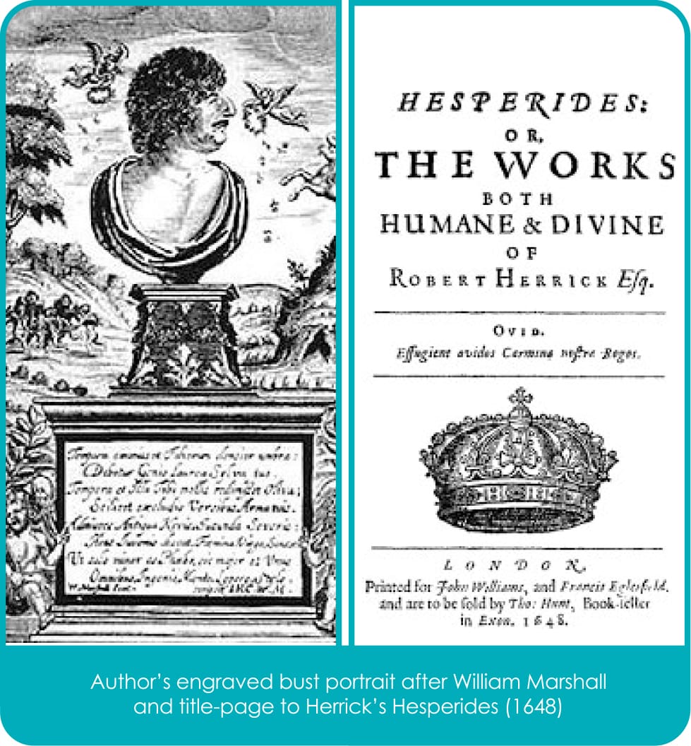
The Making of the King James Bible, Bodleian Library, 2011, p. 141). However, this was not the case with younger generations who grew up with the Bible of King James. John Donne’s greatly admired sermons, issued in three successive volumes, nowhere deviate from the KJV text.

At the Restoration in 1660 the Bible was reissued, becoming the ‘go to’ text for English religious vocabulary. The Anglican poet George Herbert, and the Anglo-Catholic Henry Vaughan made consistent use of it. John Milton, ‘republican, regicide, enemy of established churches’ and yet the versifier of Genesis and author of Samson Agonistes, a biblical tragedy, seems to have preferred using a Latin Bible; the Greek and Hebrew originals were also totally familiar to him.
Nevertheless, he owned a first quarto edition of the King James Bible, published in 1612. This was poignantly used to record births and deaths in his own family, the first entry being his own birth on 9 December, 1608. Swift, writing in 1712, praised the KJV for its ‘Simplicity,’ preferring its use of English to the contemporary language.

Important links were developed between the Bible and contemporary music. Henry Purcell, ‘the giant of Restoration music’, gave choral expression to the ‘Song of Solomon’ and other key passages of the KJV. In McCullogh and Cunningham’s words (p. 147), nothing ‘did more to ingrain the most loved passages of the KJV into popular consciousness than Charles Jennens’s libretto for Handel’s Messiah (1741-42)’. The source of its ‘masterful textual fabric’ was ‘almost exclusively’ the King James Bible.