Throughout history the Crown has used portraiture to define and promote its official image – the image which each successive monarch chooses to portray itself to the Nation. These images, whether they show the monarch as a great head of State, or as a triumphant military leader or even as the embodiment of middle-class values, have eventually come to define the visual culture of each passing generation.
On 9th September this year, Elizabeth II became the nation’s longest-reigning monarch, surpassing her great-great-grandmother, Queen Victoria. Throughout her long reign the Queen has overseen the greatest political and social changes this county has ever seen. She was born into a country which still sat at the centre of a global empire, and during her reign she oversaw the evolution of the Commonwealth of Nations.
The United Kingdom has emerged from a post Edwardian society to a vibrant, modern, multi-culture one. All this in one lifetime.
From Cecil Beaton to Pietro Annigoni, from Andy Warhol to Lucian Freud, and more recently Jamie Reid to Chris Levine – Britain’s longest reigning monarch has been painted by some of the greatest artists of her time, with each image recording the ever-evolving relationship between the Queen and her people. But what is unique about the Queen’s portraits in the history of royal portraiture, is that her face has been appropriated to become an icon of popular culture. She is both a Queen, a Pop icon and a defining symbol of punk subversiveness!
In celebration of the Queen’s Jubilee, we have put together a short survey of the Queen’s most famous portraits throughout her reign.
Cecil Beaton
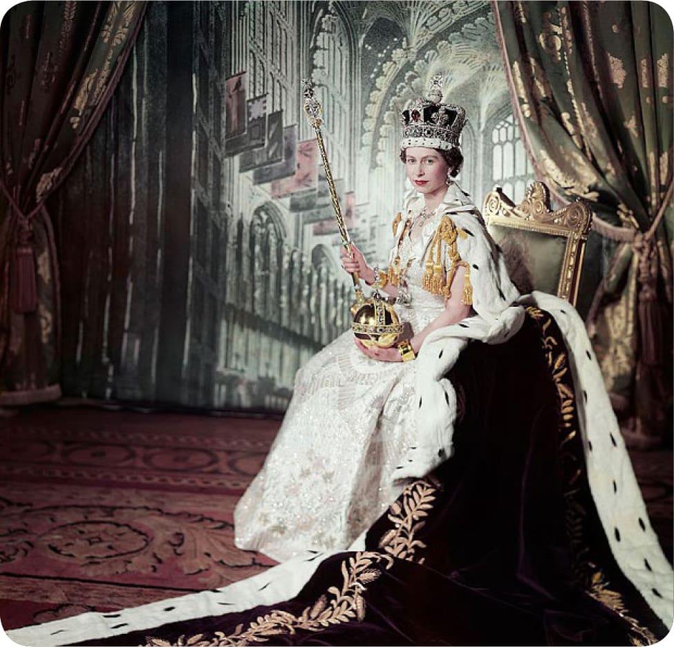
The fashion designer, Cecil Beaton, was unusually chosen to take the official coronation portrait of Queen Elizabeth on June 2, 1954. The image he created came to define the first decade of the Queen’s reign and symbolised the new Elizabethan age she heralded in. At its heart, the image is fundamentally rooted in the tradition of Royal portraiture, with the Queen shown in all the majesty of her Coronation robes – with the Imperial State Crown on her head and the orb and sceptre in her hands. Beaton manages to capture the Queen as both intensely royal but also yet somewhat vulnerable due to her youth.
Interestingly, whilst this is an intensely traditional image, the medium of photography with which it was created, together with Beaton’s visual trickery also makes it a surprisingly modern one. Although the image appears at first glance to be set in Westminster Abbey, the photographer actually employed a theatrical backdrop for the photo, which was taken in a drawing room at Buckingham Palace.

Pietro Annigoni
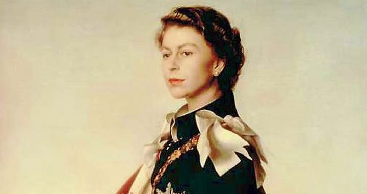
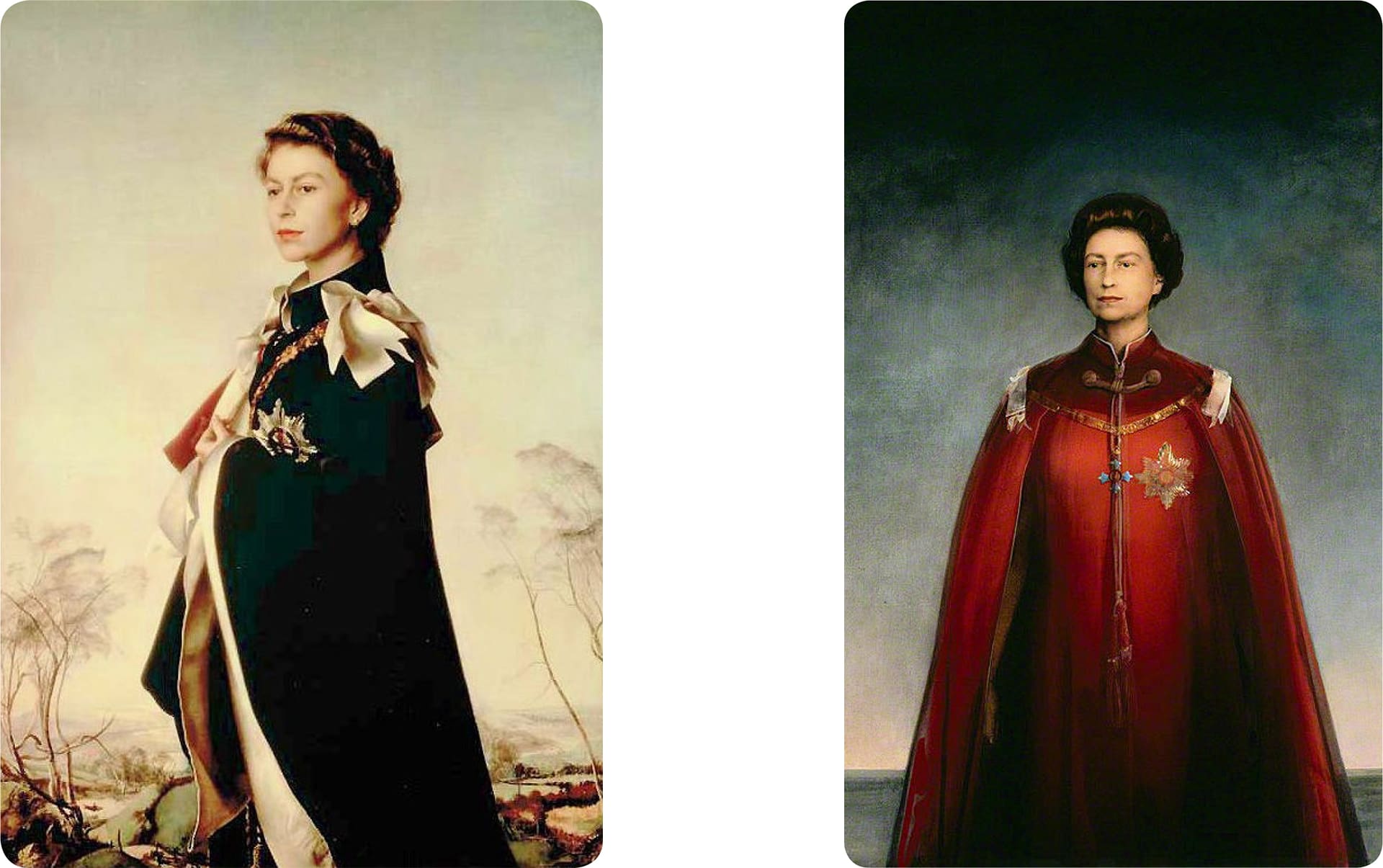
In 1954, two years after her coronation, the Italian artist Pietro Annigoni painted the first of his two famous portraits of the Queen. Commissioned by the Worshipful Company of Fishmongers in London, the painting is universally considered the most beautiful ever painted of her and is the queen’s known favourite. The artist shows the beautiful young queen in the magnificent robes of the ancient Order of the Garter and set within a beautiful Italianate landscape worthy of any Renaissance master. The resulting image is a supremely elegant and glamorous one, which has appeared on stamps and currency in British dependencies across the world.
In 1969, at the request of the Queen, the National Portrait Gallery in London, commissioned Annigoni to paint her portrait again. This time, however, the artists decided not to paint her as a glamorous young monarch, but rather as a much more remote Regal figure, silhouette starkly against an almost abstracted background. As the artist said himself, “I did not want to paint her as a film star, I saw her as a monarch, alone in the problems of her responsibility,” said the artist of the striking difference.
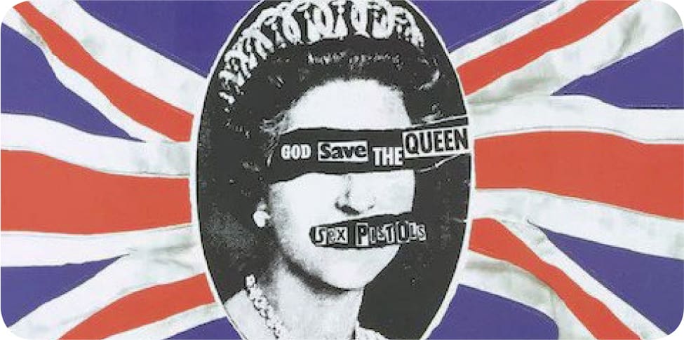
Jamie Reid
The 1970s saw Punk Rock explode onto the British scene. Anti-establishment and anarchic, Punk challenged everything the previous generation held dear, and its influence was truly global. How ironic then, that one of Punk’s greatest images is Jamie Reid’s famous Sex Pistol’s album cover showing the Queen superimposed across the Union Jack! The figure head of the Establishment being used to subvert itself. To this day, it is one of the most influential images of the Queen of all time.
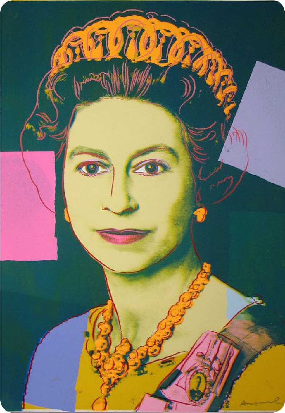
Andy Warhol
In 1985, the king of Pop Art Andy Warhol, produced his Reigning Queen’s portfolio of prints – a set of 16 portraits of the world’s four reigning Queens – Queen Margrethe II of Denmark, Queen Beatrix of The Netherlands, Queen Ntombi Twala of Swaziland and of course, our Queen Elizabeth II of the United Kingdom.
Warhol chose to depict these female monarchs, as powerful matriarchs – queens who ruled in their own right and were not queens through marriage. These portraits represent independent female authority, a different view on femininity in comparison to Warhol’s portraits of the likes of Marilyn Monroe and Billy Boy.
Lucien Freud
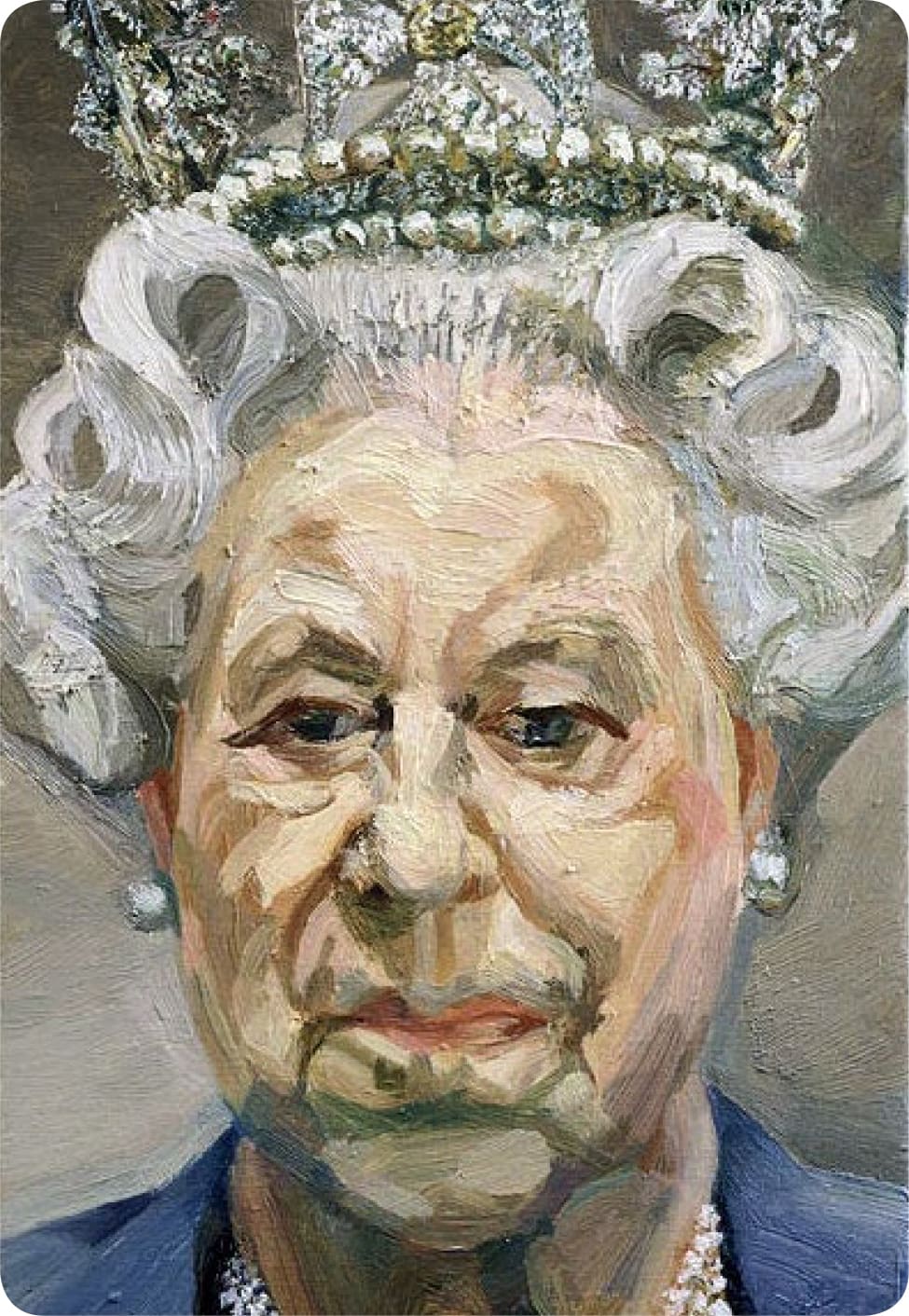
In 2001 one of Britain’s greatest living painters, Lucien Freud, painted his tiny but highly controversial portraits of the Queen. Originally meant to depict the Queen informally without a crown or tiara, Freud had to subsequently expand the canvas by 3.5cm when he decided to include the 1820 Diamond Diadem! Without doubt the most controversial
of all the Queen’s portraits, this tiny work has divided audiences since it was first exhibited. Whilst certainly not one of her Majesty’s most flattering portraits, the way that Freud has disregarded the entire tradition of Royal portraits is certainly unique.
Alison Jackson
Whatever next – the Queen taking selfies?! Well not quite! This faux royal family selfie is the work of Alison Jackson, a British photographer who has made her reputation creating convincing personal photos of intimate moments experienced by British celebrities using look alike actors. Alison Jackson’s genius lies in her ability to cast convincing doppelganger actors in the role of her famous sitters in entirely convincing, yet fake situations. One can only guess that Her Majesty must get a kick out of such fun…..the Queen as a social media savvy influencer monarch!
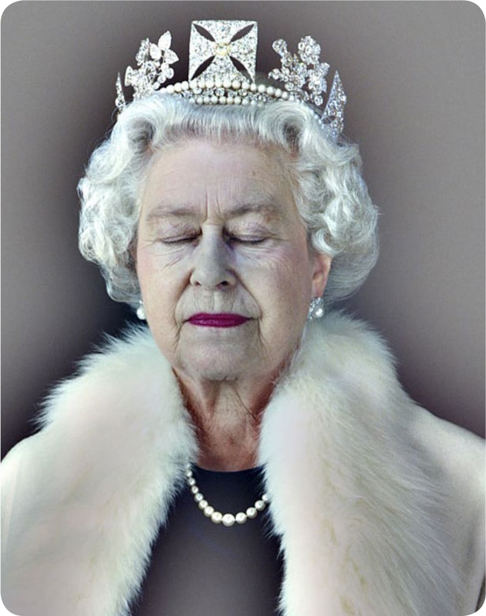
Chris Levine
In 2004, British artist Chris Levine created what can only be described as a modern classic when he produced his, Lightness of Being portrait of the Queen. The work which he produced in various formats, shows the Queen beautifully dressed in white fur and pearls, wearing the 1820 Diamond Diadem. However, what is disarming about the image is that the Queen is depicted with her eyes closed in contemplation.
The artist explained how the image came about, “I wanted the Queen to feel peaceful, so I asked her to rest between shots; this was a moment of stillness that just happened.” The resulting image is indeed peaceful and calm, yet it is also full of gravity and power – a monarch who has reigned over us for 70 years.